Sunday, October 31, 2010
Weather Motion Graphics
My first time using After Effects! Here is my video--still needs a few tweaks!
Tuesday, October 26, 2010

Wednesday, October 20, 2010
I Scream! You Scream!
I have been enjoying infographics. It has been fun to mess around with layouts, colors, and ideas for posters that display everyone's favorite type of ice cream. It looks like Cookie Dough ice cream was the most popular!!Here are a few concept sketches:


Thursday, October 14, 2010


Thursday, October 7, 2010
Monday, October 4, 2010
Eurostile and Aldo Novarese
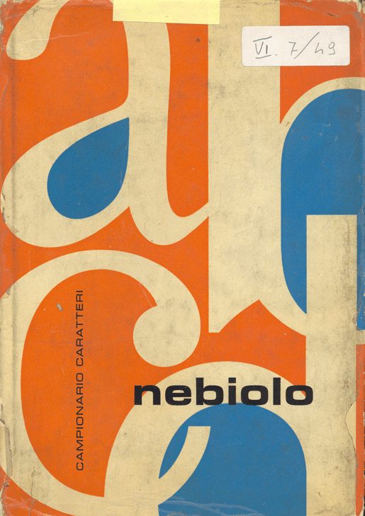


Eurostile
The Eurostile (sometimes misspelled as Eurostyle) type font style is a geometric sans-serif typeface designed by Aldo Novarese in 1962. It is a very monoline face with a high x-height and a distinct 1960s period flavor. Novarese originally made Eurostile for one of the best-known Italian foundries, Nebiolo, in Turin. Novarese developed Eurostile because although the similar Microgramma, which he had also designed, came with a variety of weights, it had only upper-case letters. A decade after he had designed Microgramma, Novarese remedied this flaw with his design of Eurostile, which added lower-case letters, a bold condensed variant, and an ultra narrow design he called Eurostile Compact, for a total of eleven fonts.
Eurostile is a popular display font. Its linear nature suggests modern architecture, with an appeal both technical and functional. The squarish shapes with their rounded corners evoke the appearance of television screens of the 1950s and 1960s. Novareese based the font off of technological advances being made in that era. With its rounded corners and square shape, the font picks up the sleek design of machinery and tries to excited people about further advances in technology. Aldo Novarese was inspired off the shape of airplane windows and also the roundness of the television sets being released at that time.
Like Microgramma, Eurostile is based around a fairly rigid and unvarying geometry, and both capital and lowercase letters are fitted to uniform widths. There is a symmetry and implied mathematical quality to the design. While this lends the typefaces an abstract consistency of form, it is a distortion of recognized proportion and hinders legibility. As such, it has found some popularity in contemporary graphic design, as well as in science fiction novel and film artwork. It is primarily a display face, and it may be used for the setting of small amounts of continuous text, and although the broad square form is not economical, its high x-height ensures reasonable legibility in the lowercase letters. Its mathematical consistency also makes it a moderately effective face for screen use. Although the font family is based on the Microgramma font, some of the characters do not follow the styling of the family. These characters include non-letter characters like integral, infinity, pilcrow; letterlike symbols like @, copyright mark, registration mark; and accents such as cedilla and the tilde. Hermann Zapf dubbed this the “super curve,” and worked with it himself in his serif newspaper face Melior®. The geometricity of Eurostile also puts it together with types like Avenir®, Futura®, and ITC Avant Garde Gothic®, even though Eurostile looks quite different at first glance.
Some key characteristics of Eurostile include it having uniform width among the characters, having horizontal finials, upturned foot on the ‘t’, a single story ‘g’ with an upturned tail, horizontal crossbars on the ‘K’, the ‘R’ curves to a vertical leg, the ‘J’ has an upturned tail resting on the baseline, the ‘y’ has a spur junction, and the ‘Q’ has a diagonal tail set deep in counter. While many individual letters distinguish Eurostile, some of the most interesting are the K and k, which have diagonals that do not touch the vertical stroke or the lowercase t, where the crossbar is long on the right and the long tail curves all the way back to vertical. A, M, N, V, and W all have flat apexes, and the Q has the odd distinction of a tail longer on the inside of the character than on the outside. Eurostile’s lowercase ‘a’ is of the traditional two-storied variety found in 19th century grotesques and most roman types. The crossbar of the f mimics that of the t.
Eurostile Extended has been used extensively in the music industry, where it has featured in album cover artwork from, Ash, The Supernaturals, Eminem, and several dance compilations from Warner. Eurostile Extended 2 can also be seen in the cover artwork for Marilyn Manson's 1998 album Mechanical Animals. It has also been used by Westlife until their album Coast to Coast and is currently used by Argentine Pop band Bandana. Variations of Eurostile are popular in television. Because of the modern, retro look, Eurostile has shown up in text for the latest technology. Often, you will see Eurostile used for the speedometer text in a vehicle. Toshiba uses this typeface for their brand name, and also many music albums prefer the retro, clean look of Eurostile. Both music artists, U2 and Marilyn Manson, were attracted to the sleek, geometric typeface. Also, the fashion brand name fcuk (French Connection United Kingdom) benefits from the design of Eurostile.
Sans-serif typeface is one that does not have the small features called "serifs" at the end of strokes. The term comes from the Latin word "sine", via the French word sans, meaning "without". In print, sans-serif fonts are more typically used for headlines than for body text. The conventional wisdom holds that serifs help guide the eye along the lines in large blocks of text. Sans-serifs, however, have acquired considerable acceptance for body text in Europe. Sans-serif fonts have become the de facto standard for body text on-screen, especially online. This is partly because interlaced displays may show twittering on the fine details of the horizontal serifs. Additionally, the low resolution of digital displays in general can make fine details like serifs disappear or appear too large.
Before the term “sans-serif” became standard in English typography, a number of other terms had been used. One of these outmoded terms for sans serif was gothic, which is still used in East Asian typography and sometimes seen in font names like Century Gothic.
Sans-serif fonts are sometimes, especially in older documents, used as a device for emphasis, due to their typically blacker type color. As their name suggests, Geometric sans-serif typefaces are based on geometric shapes. Note the optically circular letter "O" and the simple construction of the lowercase letter "a". Geometric sans-serif fonts have a very modern look and feel. Of these four categories, geometric fonts tend to be the least useful for body text. Sans-serif letterforms can be found in Latin, Etruscan and Greek inscriptions, for as early as the 5th century BC.
Aldo Novarese
Aldo Novarese was born in 1920 in Pontestura, a small town of the Monferrato region, Italy. The family later relocated to Turin, where Novarese's father worked as a customs agent, and it was in there that in 1930 Novarese began his studies at the Sculoa Artieri Stampatori (School of printing crafts). Under Francesco Menyey, Novarese studied woodcut, copper engraving, and lithography. Following this he spent three years at a specialist typography school, The Scuola di Tipographica Paravia. He also studied at the Turin Graphic School. At sixteen he joined the Nebilolo foundry in Turin as a draftsman. The Turinese Nebiolo had been the main Italian font foundry and printing machine factory since the fourteenth century. Nebiolo was one of the major Italian type foundries, at a time when Italian design was on the cutting edge -- though the type business, unlike some other aspects of visual communication, was quite conservative.
In 1939 Novarese was imprisoned for protesting against the war, but was saved from hard labour because of a gold medal he had won at the national Ludi Juveniles art competition. From 1948 to 1958 he taught graphic drawing at the Scuola Vigliandi Paravia in Turin
He returned to Nebiolo at the end of the war, becoming art director in 1952, and went on to be awarded a gold medal at the Milan trade fair. In 1956 Novarese published a typeface classification, which received much praise from professional associations in Italy and consolidated his position as director at Nebiolo. He also wrote two books on typography and contributed to a number of design and graphics publications. His incredibly prolific type-design career spanned over 50 years (into the 1990’s) and produced over 70 typefaces (over 200 if we count the various weights & styles).
He left the Nebiolo foundry in 1975 to begin freelance work as a typeface designer, and it is this later work that sealed Novarese's international reputation. He continued to work up until his death in 1995, with his final typeface, Agfa Nadianne, being completed just before his death. He designed a number of fonts, some of which include Athenaeum (1945), Augustea (1951), Microgramma (1952), Fontanesi (1954), Egizio (1955-8), Juliet (1955), Garaldus (1956), Slogan (1957), Recta (1958), Estro (1961), Novarese (1980) and Cigogna.
http://www.associatedcontent.com/article/1968612/eurostile_background_information_about.html?cat=15
http://www.linotype.com/5324/eurostilenext.html
http://en.wikipedia.org/wiki/Eurostile
http://www.identifont.com/show?118
Subscribe to:
Posts (Atom)